Thursday, May 2, 2013

A Redesign Of the PufferBelly Depot


The PufferBelly Depot project involved the redesign from train station to a gallery, studio for the artist, and home for the artist their visually impaired spouse.
 

Design - The proposed apartment has two-bedrooms, one and a half bathrooms, a sizable kitchen, and master suite containing the master bedroom and bathroom. Sharing a water wall with the master bathroom is the utility/laundry room containing the hot water heater, washer, dryer, and an industrial sink basin. Floors original to the home were preserved, refurbished and stained in a warm honey glow. Color contrasts
throughout the home add character and also create visual signals for the visually impaired so that the person can navigate freely throughout the home without the danger of tripping and falling. The studio houses the artist’s tools of trade, with storage, and workspace. The space has vertical and horizontal spaces, plenty of work surfaces, and quilting loom. The studio sits just outside the residential hallway and adjacent to the utility/laundry room. This allows the artist to readily access the industrial sink basin for the curing of fabrics and accessories. Windows fill the spaces where the original sliding doors existed. The gallery is an open space with display space for a number of pieces from the artist. Movable partitions are scattered throughout enabling the artist to choose the arrangement of future exhibitions. Plenty of wall space is provided for display. A public restroom is available for clients.

Sustainability – Many of the original walls were retained for repurposing. The master suite contains a predominant number walls adding to its character and function. All the windows including the ticket, express, and baggage windows have preserved to add historical character to the home Two water wall locations were repurposed. One room is the half bath which uses the plumbing location from the original women’s bathroom and the other being the plumbing location where the original men’s room was.
The original wall that separates the studio from the gallery is partly demolished allowing the artist to pass freely from either area. One of the display tables is the original operation table from the ticket office. The original sliding doors were repurposed around the home as to not waste any door.
ADA/UD – Accessible rooms include living and dining areas, kitchen, half bathroom, entryway, master and guest bedrooms, master bathroom, and utility/laundry. Accessible rooms include the gallery and restroom. Plenty of space is made for the ambulation of wheelchairs.

There are a few things I've learned from the duration of this project:.
There is such a thing as being too detail-minded in the learning stages of design. It isn't that the details aren't important it's that the creative part of learning can't be perfected in a few months time and holding it to a standard of perfection diminishes the afterglow of creativity. 
Also, I see the importance of the informal, napkin, scrap paper sketches as it pertains to spatial planning. Practicing this will help me capture the moment I see the space when I'm imagining myself standing in the middle of a room. These moments aren't planned, they simply occur and a formal sit down can stifle the small bits of creativity that lie dormant in the rush of deadlines.
Overall, this experience was exhausting and amazing. The process created anxiety through my feelings of utter joy and excitement. I'm looking forward to being pushed like this again and blossoming as a designer.



Sunday, March 17, 2013

Vision Disability-Ability Workshop

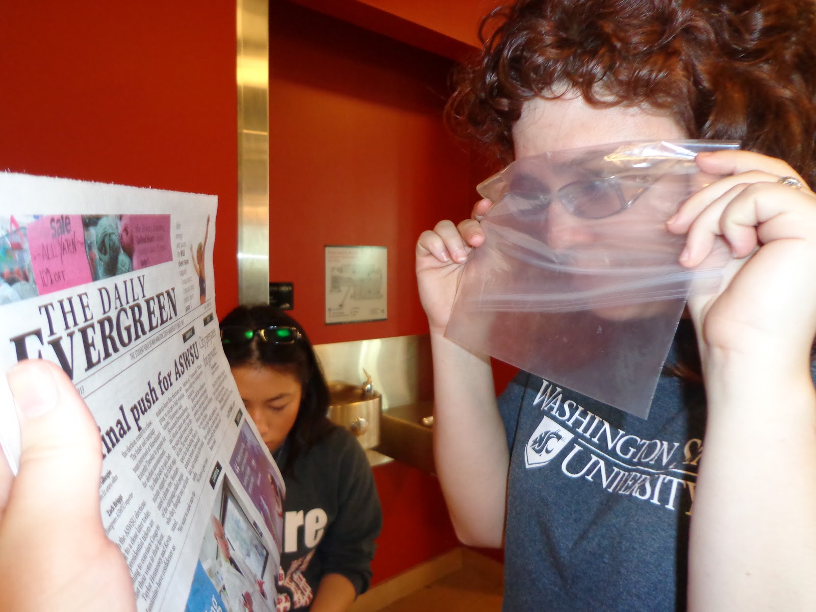
Attempting to read through 4 layers of plastic
The effect of petroleum jelly smeared on the inside of sunglasses
Attempting to find the keypad and card-swipe at the ATM
-Looking through two layers of plastic bag made my vision blurry. I could make out the images with some shape within the picture and the title came in legible. The text of the articles was illegible. -Looking through four layers of plastic bag made my vision more blurry. I could make out the general shape of the newspaper and I could recognize the shape of the images, but the titles and article text was illegible. -The varying degrees of vision impairment tended to be very frustrating because parts of my field of vision were blocked. I need to constantly repositioning my head to gather all the information from the newspaper and my surrounding environment. The simulation of complete blindness was completely frustrating within seconds. It is important to remember that a person that is blind must feel a great amount of irritation and the last thing they need is a built environment that doesn’t relieve their physical burden. -The exercise wearing the sunglasses with petroleum jelly, was, well, gross, but I forged ahead. I stood in front of the elevator and found that the buttons were easy to see, but once in the elevator the lighting was so dim I couldn’t make out the buttons as they were the same steel as the panel; fashionable, but completely unhelpful. -Still walking around wasn’t terribly difficult because the ripples in the jelly created a prismatic effect which enabled me to guide myself down a hallway. -At the ATM machine I was able to navigate the keypad because the tactile texture of the keys changed from a braille symbol on each key to a central bump in the middle of the keypad. I did have difficulty finding the key swipe as it blended in with the rest of the machine and it wasn’t illuminated. -The stairs down the atrium were tedious. I was unsteady and worried I would miss a step. The tread on the steps worked well to contrast, but with the jelly glasses the prismatic effect warped the contrast.

Monday, December 17, 2012

St. Elmo's 1 Bedroom Model

The model of the 1 bedroom helps elaborate my message a little better. In three dimensions, you can see how open the space is for a 1 bedroom. Even though I set up turns and angles with places to explore it still feels open with room to breath. The orientation of the rooms served to purposes. I wanted St. Elmo's to stay on the historical registry which means that I did not want to move or add any windows that would alter the exterior side of the building. Within this restriction I set for myself, I thought it best to provide the most light to rooms that we may spend the most amount of time in. Access to lighting helps the aesthetics of the apartment allowing wider array of design options and simply being able to add plants.

St. Elmo's Common Space

The common space on the second floor of St. Elmo's hotel was a challenge, but proved to be rewarding. Once I set up the partitioned private entrances the space started to make sense. It effectively separated personal space from public with walls of reclaimed and restained lath. The fireplace was meant to be a welcome to patrons of the spa, maybe as an extra waiting room. To further promote the image of professionalism, I created a water feature that advertises and calms. Still amongst all the calm this is meant to be a primarily transient place.

St. Elmo's 1-Bedroom Apartment

This is the detailed breakdown of the 1-bedroom floorplan and elevations. Technically, the toilet and lavatory are ADA compliant and all measures in the apartment fit within the parameters of interior design standards. I liked playing with angled, built-in shelving in the kitchen, living space and bathroom. Playing with these angles made the space feel alive. I oriented the slats of the wood floor north-south, so that the space welcomes you.

1 Bedroom & Common Space Parti Plan

The theme I used to create the one bedroom and common space plan was based on the dynamic bending and shaping of human growth in relationships. I wanted the foot steps to lead somewhere interesting keeping within parameters of warmth within the home. My parti lays the pathway for the floorplan.

House of the Immediate Future

Habitat for Humanity held an outdoor and informal symposium about The House of the Immediate Future. I toured a house made for developing countries and one for a developed country as ours. What struck me was how little we really need to survive and be happy. The concept of the wet core is a wonderful idea, but still needs some fine tuning. I'm looking forward to seeing what advancements come up in the future. In this image, I sketched the ramp and entrance of an immediate home.

Sketch Crawl

In Seattle, artists and sketchers participate in sketch crawl at different locations in the city. I was able to them one day at the Olympic sculpture park. I sketched The Eagle, an amazing sculpture that had a majority of the sketchers enthralled. Whole groups of people sat in the shadows at each leg. My angle was distant and I was able to capture the whole structure. In my mind I imagine all the angles I could have found in that piece and the various ways I could interpret them. I look forward to going back one day and trying to draw it straight underneath with sky as a backdrop.

Wednesday, November 28, 2012

Meeting with Capital Planning Designers of WSU

I was fortunate enough to give a quick and dirty presentation of my design plans for the 1-bedroom apartment and common space on the 2nd floor of St. Elmo's hotel to Jennifer Reynolds, Joanie Thomas, and Stacy Gravel, interior designers working for WSU. The common space presentation seemed rather seamless; I think they went with me on the water feature, fire place, and private entrances for the apartments. However, when I proposed using 3 Form materials for the private entry doors Stacy stated that the expense would be great. I took that into consideration because it seems a rather expensive feature should be displayed prominently and publicly. This business venture is a small boutique with local and small tourism patrons and little focus on the materials used to create this built environment. I plan to replace the 3 Form resin doors, possibly continuing the theme of recycled lath from the wall to the door. I have been and may remain vexed over the south wall the 1-bedroom apartment (insert sigh here). I struggled with trying to put 2 lavatories in the bathroom, arranging the shelving near the entrance, and maneuvering the kitchen island as to not impede traffic. First of all, the designers agreed that I do not need 2 lavatories for a 1-bedroom apartment. The second suggestion they had was to merge the kitchen island into the counter space and make a peninsula. Finally, they advised that I should adjust the swing of the door since it's layout is a bit awkward. I am taking all of these suggestions and flying with them. The picture given here tells the tale of my south wall dilemma. I've settled on the lavatory setup and I'm drafting up a new entryway in connection with the kitchen.

Saturday, October 13, 2012

Aging in Place


Context Poster Comments:
Considering the template – the initial ideas I used in constructing the template for my other group members seemed universal with the faded pictures of human factor and ADA guideline measurements. I oriented it the picture background pictures in lines with spaces between, but it tended to mess with the formats the rest of my group members needed for picture and text box orientation. I essentially chose a format that forced everyone to fit into my style rather than allowing for the freedom of my group members to explore their own creativity.
Next time, I won’t attempt a more stylized version of a template and focus on a more universal format.
Furthermore, I became confused with the parameters of the assignment. Upon further examination, I noticed it read more as an advertisement of the products used and how the dimensions could be considered in smaller places, so it lacked the professional feel of a true case study.
I learned that in order to create a well-rounded and informative presentation on aging in place there needs to be more visual rendering of the location, such as: floor plan with an overlay of bubble diagrams to mark flow and maneuverability which is a mathematical and essential part of ADA guidelines. From this point it would’ve been easier to establish importance of universal design with an emphasis on aging in place.
I am pleased to know that today many designers automatically include aging in place dimensions when modeling new homes effectively saving home owners the trouble of the high costs of remodeling their homes to accommodate the aging tenant.
Posted by Picasa

Personal Critique of Kitchen Project

Upon further reflection and research, I found that resins should not be placed near extreme heat, so I would remove the tortoise reed resin from the backsplash and run it vertically from the kitchen to the ceiling. This is double duty as it solves my dilemma of that blank wall. The width of the door is incorrectly drawn on the floor plan; the 36” width is not represented correctly. I’m wondering if my color choices will make the occupant feel like they’re living in a honeycomb. I extended the wall between the bedroom and bathroom to leave more options for the bathroom redesign, but from the view of the kitchen and living area it seems this may be an awkward setup. One of my perspectives that views the living area from the kitchen makes the spaces seem longer because my table and chairs are not in correct proportion to the space. Part A of this flaw, the wall behind the sink is blank. Part B, I’m not sure what to think.

Concept of Kitchen Space

The growth and welfare of people who are bound together depends upon the intricacies of relationships and how they bend, twist, and grow. Upon entering the space the occupant travels the angular concavities past the front closet, past the dining room table and into the welcoming embrace of the kitchen. This pathway is at once rectilinear and curvilinear as each functional storage space bends at soft angles. Two such spaces in the kitchen, the bending turn toward the sink and a twist to the side of the refrigerator, open possibilities by creating a fun contrast through a change in structural expectation. The horizontal lines of the cabinets run parallel to the wall lengthening the perceived space, but are broken midline by the perpendicular shapes above the stove to contrast the strength of this feature. The open U-shaped kitchen is meant to invite more friends and family in and encourage mingling and sharing. Sustainability is emphasized by the use of durable Quartz One countertops and rescued woods used on the floor and for cabinetry and tortoise reeds suspended in environmentally friendly resin. The large chalkboard painted pantry doors allows the freedom of hand that says, “Like the growth of a rose in concrete, this network of friends must insist on occupation.”

Volumetric Kitchen Model

Kitchen Floor Plan Presentation

In the bottom right corner is the proposed layout of the one and two bedroom apartments and spa on the second floor of St. Elmo’s hotel. Oriented toward the upper middle in the magnified view of the kitchen and family room. Referring to the inspiration parti, I designed the floor plan of the apartment to kink and bend into different interesting nooks of the main living space.

Materials - Cabinet Face

Translucent insert, Rain pattern made of Lumicor Embosses resin & Laminate facing in Deepstar Mineral 1817-35 from Wilsonart HD Premium

Materials - Flooring and Cabinetry Frame

Terramai reclaimed Golden Rose Flooring from the Paduk and Narra wood species from a demolition salvage in Southern Asia

Materials - Countertops and Backsplash

Countertops – Quartz One polished composite material NQ24: Stormy Sky from Daltile Backsplash – continue Quartz One Stormy Sky composite up to cabinets with Lumicor’s Tortoise Reed resin from the Botanicals series placed flush against the Stormy Sky composite
The following posts are explanatory segments of a proposed redesign for the kitchen, and living room for context, of the two bedroom apartment keeping in mind the theme of the dynamics between people and an added dimension of sustainability.

St. Elmo's Hotel in Palouse, WA

St. Elmo’s Hotel was built in 1888 in Palouse, WA and is a historic landmark for the local community. The building is being refurbished back into a hotel with a spa and 2 rental suites , one and two bedroom, on the second floor.

The Trouble with the In-Between

The concept of a home, being that which originates from the heart of people, challenges accepted concepts of design. How can a poem morph the physical box in which a person resides? What can the physical processes and materials of design do to complement the dynamic provocation of the death and rebirth of people so affixed in the concrete jungle that is home? It is the life, struggle, and death of people who create what is considered home; therefore, it is left to interpretation.