Friday, July 27, 2012
Process Poster
As ideas grow in the mind of Dale Chihuly and gradually find definition so does the bloom of the orange lily. The lily draws interest into its center and warms with adaptable, curvilinear lines. The values of the orange and yellow colors unify with repetition while the contrasting, crisp new green provides striking emphasis.
The seat and shelter originate from the natural curves and veining growth of the petals. The asymmetrical weave creates its own identity and value at each veining juncture.
Where a simple relationship between lines and shapes remains innate between organisms of nature, the human organism implies special meaning to the orientation of shelter to environment. To bloom is to die and at this pinnacle is the height of beauty that should be shared and sheltered. An interchangeable definition of space and meaning forms the art of interpretation making this seat and shelter an apt structural element of a hospice.
Thursday, July 12, 2012
1-Point Perspective and Tonal Value Sketch
This is 1-point perspective sketch with the manipulation of tonal value. The sketch image on the left was done with a flair pen and graphite on the right.
I sketched this image I retrieved from Architecture: My Ninja Please . The picture is a hallway at the Nisha-Bar Lounge; designed by Pascal Arquitectos .
Perspective Sketch
This perspective sketch is of a chair at six different angles. I experimented with Picasso's drawing style, but it leaves an observer wanting.
Wednesday, July 11, 2012
Napkin Apartment Sketch
This sketch is of my apartment. With a flair pen, I quickly traced the floorplan and elevation. The loose paper fibers made it difficult to be exact or tenative. This was good practice for the hit-go-hit line technique of drafting.
Man-Cave Hybrid Drawing
This is a rough sketch of a small imaginary room with rudimentary elements such as the door, window, couch, and coffee table. From here I scanned the picture into Adobe Illustrator.
While in Adobe Illustrator I traced the key elements using the Wacom tablet and included the walls without the drafting grid.
This is the actual trace, minus the grid, that I used as a template in Adobe Photoshop and placed found images.
I retrieved different images from the internet based on a triadic color scheme of red, green, lt blue, and warm lt orange brown. The result is the hybrid drawing with a man-cave theme; notice the unicorn in the background?
From 2D Abstract Thinking to 3D Modeling
Model 1a:
The model kept the radial center of the drawing, but curled into space asymmetrically. Quick Descript: Curly-q shape with strips of sheet metal following the lines of the chipboard.
Model 1b:
This model mimicked the two-dimensional abstract drawing by displaying more concrete symmetrical balance. Quick Descript: Curved cross with crescent propped on top.
Model 1c:
Centrally located in the model were the beginnings of radial balance broken up by random length chipboard strips making the piece asymmetrical as a whole Quick Descript: Horizontal and vertical lines attached at the axis and fanned out to imply radial balance.
Model 2a:
The model is composed of three-dimensional curvilinear lines with an asymmetrical sheet metal object that lay across the inside. Quick Descript: Emphasis on curved lines, circle and leaf shaped.
Model 2b:
The movement of the curved lines creates an organic flow in the asymmetrical model. Quick Descript: flat, looping, paisley shaped petals.
Model 2c:
An oval wrap created dimension and an interesting negative space. Quick Descript: Cuffed leaf-like structure.
The geometry of the arch in the sketch was modified by creating three crescent shaped belts of chipboard. Quick Descript: Three vertical prongs recessed into half globe shape.
Model 3b:
The geometry of the model contained rectilinear and curvilinear shapes that served as the building blocks of the controlled angles and lines. Quick Descript: Sternum and rib shape with curled sheet metal at the top.
Model 3c:
Four three-dimensional views mimicked the geometry from the drawn abstraction. When looking at each angle separately the illusionistic space implies actual space. The metal swirl and wave-like lines breaks up the radial and symmetrical balance. Quick Descript: Oval globe with horizontal cross-sections.
More information about the mass of models as a whole:
Each nonobjective model had free-flowing, curved lines that give this overall project a more organic feel. Tactile and visual textures built in actual space and the protruding sheet metal shapes broke up the drab brown of the chipboard and created variety through contrast. The asymmetrical drawings and models are 3” x 3” and under 6” x 6”, respectively. Strips of sheet metal took on a curved orientation at varying widths. A variety of negative spaces set against a black background created interest around each model.
Scrapped model 1 was the first model I made and it was too large. Also, most of the interest lay inside the model and was difficult to peer through. Scrapped model 2 turned out to be a jumbled mess, so I kept experimenting with it for ideas on other models.
My Process of Abstract Thinking 3
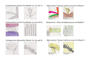
From Abstraction 2, I chose three sets of two abstract drawings and used the Wacom digital tablet to process each abstraction and break each piece down to the simplest lines.
I redrew each abstraction paired with another and labeled them Abstraction 1A and 1B, 2A and 2B, and 3A and 3B.
Each set of two were combined with each other to make one abstraction which I used as a loose template for Models 1a, 1b and 1c, 2a, 2b and 2c, and 3a, 3b and 3c.
Abstraction 1:
The beginning of the drawn abstraction seemed to take on a radial-like shape, but is broken up by asymmetrical elements. I plan to incorporate the center radius into, at least, one spot on each model.
Abstraction 2:
I derived a seemingly unrecognizable, pictorial abstraction from two different interpretations of the stamen of an orange lily. The sketch is completely asymmetrical with fluid lines implying an ease of flow.
Abstraction 3:
Abstraction 3 begins with the geometric shape of 2A; a curvilinear and a rectilinear polygon of 2B placed together. Geometry is further reinforced by the parallel rectilinear structures, but broken up by a curved, asymmetrical shape at the tips.
My Process of Abstract Thinking 2
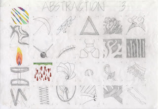
This first abstraction started biological. I zoomed in to capture the intricacies of the orange lily; the cellulose stalks of the stem, the shift in color from green to yellow to orange in an array of orientations, the outward curl of the set of streamline petals, and the veining of the second set of ruffled petals. Examining the flower so closely sparked other conceptual images related to its components.
The first images I contrived were rather immature; the cartoonish shapes, the reliance on geometry, and some pretty garish colors. But the more I tinkered and let my hand flow I started to delve into a more abstract world. I contended with the initial biases of abstract thinking; what is the use of exercises in the abstract? After I labored over this thought I found that abstract thinking is one of the major foundations of design. In order to design an inspired space, one needs to practice the art of abstraction and meld it with function.
I built more abstract concepts off of abstraction 2. I learned that I didn't need to make every square a piece of art. The goal was to break functional aspects of the object down to incremental, pictorial abstract thoughts from which to build a design.
My Process of Abstract Thinking
After studying Dale Chihuly I chose an orange lily for my inspiration object because his work made me think organic and in color. The line and structure he uses is wild and free, yet somehow captured and tamed for art.
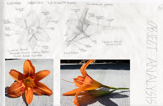
I began my analysis by identifying the principles and elements of design in the orange lily that are innate in nature. What follows in consequetive posts are the processes by which I derived the concept of an abstract seat and shelter for a person.
The second object analysis became a more formal drawing of my inspiration object complete with transverse and sagittal sections of the orange lily.
I sketched out what I took to be the components of Dale Chihuly's artwork and considered how I could relate these same concepts in my abstractions.
Sunday, July 8, 2012
Replace a Crayon for a Paint Brush
This is my first Adobe Illustrator picture and, apparently, an attempt at art. I'm not sure which effect would be worse, using the paint brush to color in all the minute details of the barn or make silly circles and rays out of the wagonwheel gate then proceed to tell everyone that I'm a cucumber. It's all pretty juvenile, but we all gotta start somewhere.
Dale Chihuly
Dale Chihuly is an interesting, free form artist with a love for color which is inspiring and exciting. To me, color is like air and necessary for living, so when I stumbled upon his work it instantly captivated me and I chose to research him as an artist for my class presentation. I am not well educated in the finer arts, so this was a monumental discovery for me. With so much color to saturate, and mildy obsess over, I found it difficult to choose what pieces from what exhibition from what museum or art house to highlight as representative of his body of work. Even now I can't help but think about the blue reeds in the garden or the sun inspired, tangled mess of spiraled glass displayed right now at the Seattle Center. This was a laborious and fun project.
Saturday, July 7, 2012
Fruit Sketch
I used fruit that had at least two characteristic colors; the grapes with a deep purple to purplish-brown, the apple with green and orange-red, and a banana that is not quite ripe displaying yellow and green.
Principles of Design
I explored how the elements of design are manipulated by principles such as, unity and variety, balance, proportion and scale, rhythm, emphasis, and harmony. Whole compositions, based on these principles, displayed the functions and customs of ancient Egyptian life. Similar to my research on the elements of design, the best examples of application were in architecture, sculptures, and paintings.
Elements of Design
I researched what basic components were used to make the architecture and design of the ancient Egyptian culture; line, space, shape, texture, and color. I relied heavily on the architecture of buildings and their support structures, sculptures, and three-dimensional renderings of cultural symbols to identify examples of line, shape, and texture. The secondary resource I used to define the elements of visual texture and color came in the form of two-dimensional storytelling of hieroglyphs and murals that reinforced how well ancient Egyptians grasped the elements of design.
Casting Edges Sketch
This is a sketch of an arbitrary set of stairs on the Washington State University campus. I recorded the shadows cast on the steps in my sketch book. I then placed a piece of vellum paper over the sketch and traced the structure of the stairs and the outline of the shadows. The single hash marks on the casting edges indicated a vertical shadow and two hash marks meant that the line was horizontal.
Subscribe to:
Comments (Atom)


